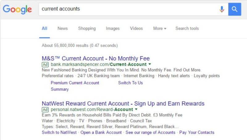
The new look was seen in the UK on desktop.
It looks like Google is back at it with testing ad label variations in the search results. After transitioning from yellow to green in 2016, Google appears to be testing a green outlined label.
Twitter user @matibarnes in the UK shared a screen shot on Twitter Tuesday. Here’s the test treatment he spotted of the ad label with green outline on white background:
Here’s how it compares to the current green background label.
When Google transitioned from the yellow to green ad label, many questioned whether it made it even more confusing for users to distinguish ads from organic listings. At the time, the company said its tests indicated no impact from a consumer confusion standpoint, and at SMX Advanced last June, Google’s director of product management for search ads, Sundeep Jain, said the move was made primarily to simplify the elements on the page, particularly for mobile.”We want to make it easier for users to digest information on the page, so we’re gradually trying to reduce the number of variations of colors and patterns on the page and bring a little bit more harmony to the page, which is why we reduced one of the color elements on the page,” he told the audience.
I have not seen the green outline in the wild yet, but let us know if you do. For a look back at Google’s ad treatment over the years, check out our visual history of Google ad labeling. Might need updating soon?


