Simple average is ok but histograms of your CPC data can help to better understand outlier data points. This is part one of a three-part series about Bing’s data distribution tools.
In the field of business intelligence, and specifically, the BI extracted from search performance, averages are ubiquitous. Cost-per-click, cost-per-acquisition, and average position are metrics that should immediately come to mind, but others such as average order value lay in the weeds as well.
There’s nothing inherently wrong with a simple average, but in many cases they can be useless or misleading because of their susceptibility to extreme influence by outlier data points. To briefly illustrate the point, consider a portfolio of ten keywords. Nine of those keywords have one click each, all at the cost of $1. The tenth keyword also has one click, but this one came at a price of $6. This brings the average CPC of the portfolio to $1.50, which is an obfuscation of a lot of important information.
Of course, portfolios are generally much larger than ten keywords, and with scale the opportunity for averages to muddy the waters of your analyses also grows. As such, the aim of this three-part series is to help you become comfortable thinking about your data regarding distributions, which will help bring more information and context to your business intelligence metrics, and help you depend less on averages.
Let’s start by highlighting the difference between a summary view and a distribution view, moving forward with CPC as an example. Below is a standard method for visualizing CPC performance for a single month.
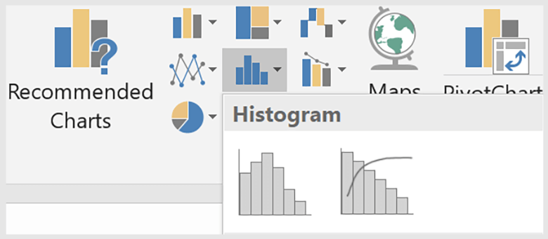
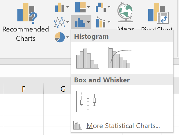
But we can immediately unlock a lot of information about this month by segmenting the keyword report we pull down from the Bing UI by day. Since we’re working with CPC data, we’ll want to remove any line items from the Excel file that have 0f clicks. Once we do that, select all your CPC data for the month, and create a histogram.
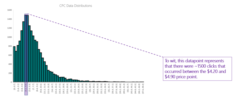
Our resulting plot is below:
The histogram is a common visualization for data distributions. It features a binned x-axis, which means that each tick on the axis represents a range of values. Each time a value is represented in the dataset, it is binned accordingly. The cumulative count of values within a given range is called frequency and is represented on the y-axis.
Next, calculate the mean and median of your CPC data. In Excel, achieve this using the =AVERAGE() function for mean and the =MEDIAN() function for the median.
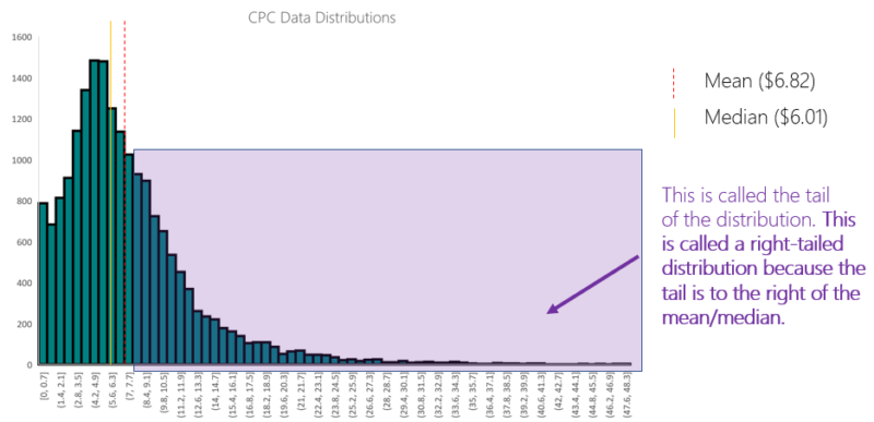
Remember that our Average CPC for the month was $6.82. Our median CPC comes in at $6.01. That’s a whopping $0.81 difference and an absolutely valuable piece of information for this advertiser.
The gap between the mean and median CPC is caused by the right-skew of the distribution. The farther along the tail a value is, the more that value is capable of influencing the mean. All data points have an equal influence on the median.
Before we looked at this distribution of CPCs throughout one month, all we knew was that the average click cost was $6.82. Now we understand that the advertiser had a much higher probability of receiving a click in the $4.20 to $6.30 range than they did in the $6.40 to $6.90 range.
Histograms are just the tip of the iceberg when it comes to understanding data distributions. In the next part of this series, we’ll explore this same dataset using a box and whisker plot.


