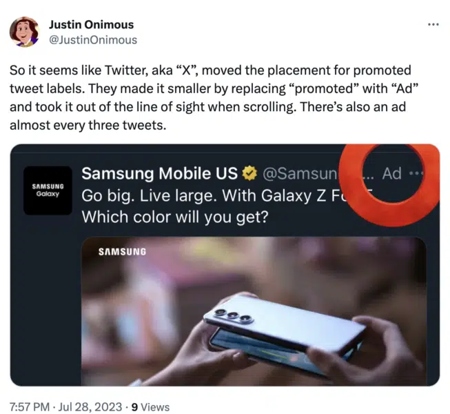
Ads on X are now harder to differentiate from organic posts. Will it result in more clicks or engagement? Monitor your metrics.
X has modified the appearance of ad labels on promoted posts, making them “less noticeable.”
Twitter Ads (X Ads?) now features the word “Ad” in the top right corner of posts, next to the three-dot menu button.
Previously, the word “Promoted” would appear in the bottom left corner of posts, along with an arrow icon.
Why we care. This change is similar to what Google and Microsoft have done with PPC ads in their search results pages. While this change could result in more accidental clicks or engagement, that doesn’t mean it will lead to more conversions. If you’re running Twitter/X ads, watch your key performance metrics heading forward.
How have X users reacted? As is fairly typical with any change on a social media platform, users aren’t impressed with the change. Many X users said the new layout makes ads look less like ads and more like organic posts. Here are a few reactions we saw from various X users:
- “They made it easier for me to scroll past ads. I used to have to get to the bottom of the tweet to see it was an ad. Now it’s at the top.”
- “Instant block for all ads.”
- “Now it’s closer to the block button.”
- “As a direct response, I’ve stopped just scrolling past ads and now I’m blocking every single ad I see.”


Test or permanent? X has yet to comment on the ad label change. It’s possible that the social media platform is texting this new format before deciding whether to implement any changes permanently. We will wait and see.
Why now? The move comes as X tries to entice advertisers back to the platform following a 59% drop in ad revenue after Musk’s takeover last year. Just last week, X announced that it was offering huge discounts on video ads with up to 50% off. The ad label change may also be part of the platform’s ongoing strategy to lure brands back, but given the reaction from users, this idea may be questionable.


